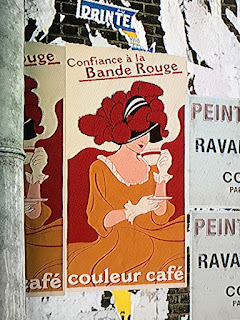
This is a photograph I snapped while watching my son play a video game earlier this afternoon. It is from a multi-player map in the game Battlefield 1. The snapshot of a TV screen does not do the artwork justice, the graphics in the game are fantastic. It is quite unbelievable how video games have gone from a 8-bit technology a little over twenty years ago to today. I would label this image in the style of Art Nouveau. Although the size of the poster seems a little small for the lithograph poster size of the time, it has a few distinguishing characteristics. I immediately thought of Henri de Toulouse-Lautrec when I caught a glimpse of this poster. It got me thinking about the self-assured happy women that were idealized in the Art Nouveau lithographs. The simplified art and the appearance of hand written type gives a few more clues about this style. The last clue is the black or dark outlines that are filled in with flat colors and abstract shapes.
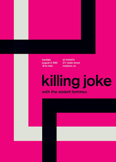
This is a retro designed poster mimicking the International Typographic Style of the mid 50's to the mid 70's. I saw this poster on a website where the artist is selling prints of his work. The quality of his work is pretty well done, a lot of his designs that claim to be of Swiss style are somewhat off. This particular poster seems to get it pretty right. It has the flush left and ragged right font setting, abstract shapes that are asymmetrical. The font is also a sans-serif that would have been predominately used during that period. I was attracted to this piece when looking through a website called Touch of Modern. It really seemed to fit with the theme.


Comments
Post a Comment