
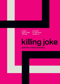
I feel the quality of work is good, the type is easy to read and the band of colors at the bottom brings your eye to the piece.
The type in the header resembles Rockwell but it is not an exact match. The rest of the poster seems again to resemble Arial. This is interesting because when I was thinking about who might have designed this poster, I came to the realization that it could be the same designer that did the other post of mine.
Like my previous post this image is again masculine, with a classic vibe. I feel the color adds a slight amount of warmth and that is what really drew me to the image the most.
Comments
Post a Comment