Posts

Showing posts from November, 2017
Image
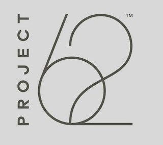
This is a identity for a brand of furniture that I saw at Target over the weekend. These wordmarks were everywhere promoting their new mid-century modern style under this label. The design has a real elegant look and the designer did a great job with appropriating the style of the furniture with the logo. The initial reaction I got from this wordmark was a art deco feel. I feel it bleeds into the late modernism era as well. The style of the sixty-two closely resembles the Broadway font of the art deco period.
Image
This is a photograph I snapped while watching my son play a video game earlier this afternoon. It is from a multi-player map in the game Battlefield 1. The snapshot of a TV screen does not do the artwork justice, the graphics in the game are fantastic. It is quite unbelievable how video games have gone from a 8-bit technology a little over twenty years ago to today. I would label this image in the style of Art Nouveau. Although the size of the poster seems a little small for the lithograph poster size of the time, it has a few distinguishing characteristics. I immediately thought of Henri de Toulouse-Lautrec when I caught a glimpse of this poster. It got me thinking about the self-assured happy women that were idealized in the Art Nouveau lithographs. The simplified art and the appearance of hand written type gives a few more clues about this style. The last clue is the black or dark outlines that are filled in with flat colors and abstract shapes.
Image
This is a promotional poster for the major motion picture Ocean's Twelve. I own this movie and remembered it when doing homework for this week. Neville Brody is the designer for this particular poster. I have always enjoyed the 12 on the tilted axis, and the red, white, and black color scheme. This design is more put together to be considered in the true style of postmodernism. With that being said though, knowing that Brody did the design I see a lot of the postmodernism's motifs. I would call this poster postmodern.
Image
This is a advertising print. It was made to promote bands in San Francisco. I remembered a friend having a poster similar to this one back in high school. We used to look at it under a black light. I couldn't find the actual poster, but this is real close. With the poster being hand-drawn, I find the quality of the artwork very high quality. It is one from the psychedelic era that I don't mind. Being from the psychedelic style the typography is more of a hand-drawn style. I was mainly drawn to it through memories of this style in high school. It is very fun, playful, loud, and very trendy.