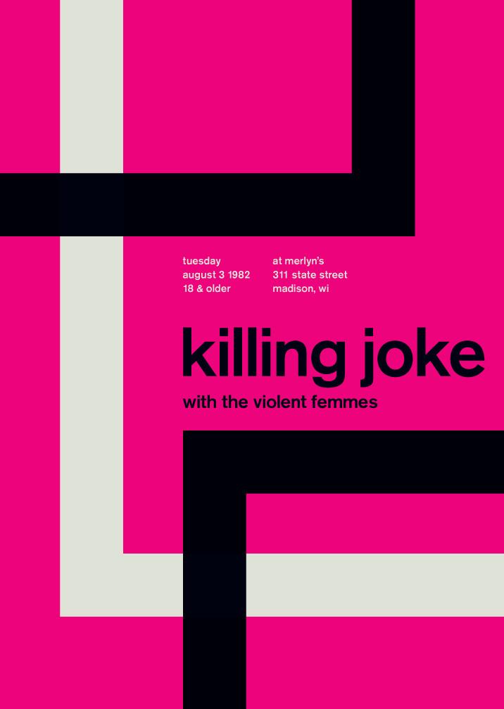
This is a retro designed poster mimicking the International Typographic Style of the mid 50's to the mid 70's. I saw this poster on a website where the artist is selling prints of his work. The quality of his work is pretty well done, a lot of his designs that claim to be of Swiss style are somewhat off. This particular poster seems to get it pretty right. It has the flush left and ragged right font setting, abstract shapes that are asymmetrical. The font is also a sans-serif that would have been predominately used during that period. I was attracted to this piece when looking through a website called Touch of Modern. It really seemed to fit with the theme.

Comments
Post a Comment