Posts

Image
This is a identity for a brand of furniture that I saw at Target over the weekend. These wordmarks were everywhere promoting their new mid-century modern style under this label. The design has a real elegant look and the designer did a great job with appropriating the style of the furniture with the logo. The initial reaction I got from this wordmark was a art deco feel. I feel it bleeds into the late modernism era as well. The style of the sixty-two closely resembles the Broadway font of the art deco period.
Image
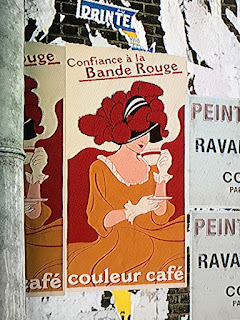
This is a photograph I snapped while watching my son play a video game earlier this afternoon. It is from a multi-player map in the game Battlefield 1. The snapshot of a TV screen does not do the artwork justice, the graphics in the game are fantastic. It is quite unbelievable how video games have gone from a 8-bit technology a little over twenty years ago to today. I would label this image in the style of Art Nouveau. Although the size of the poster seems a little small for the lithograph poster size of the time, it has a few distinguishing characteristics. I immediately thought of Henri de Toulouse-Lautrec when I caught a glimpse of this poster. It got me thinking about the self-assured happy women that were idealized in the Art Nouveau lithographs. The simplified art and the appearance of hand written type gives a few more clues about this style. The last clue is the black or dark outlines that are filled in with flat colors and abstract shapes.
Image
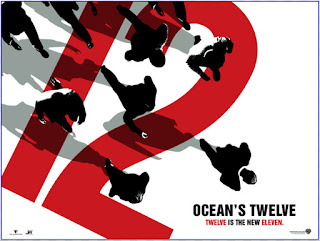
This is a promotional poster for the major motion picture Ocean's Twelve. I own this movie and remembered it when doing homework for this week. Neville Brody is the designer for this particular poster. I have always enjoyed the 12 on the tilted axis, and the red, white, and black color scheme. This design is more put together to be considered in the true style of postmodernism. With that being said though, knowing that Brody did the design I see a lot of the postmodernism's motifs. I would call this poster postmodern.
Image
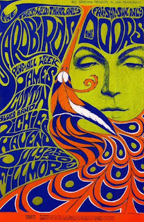
This is a advertising print. It was made to promote bands in San Francisco. I remembered a friend having a poster similar to this one back in high school. We used to look at it under a black light. I couldn't find the actual poster, but this is real close. With the poster being hand-drawn, I find the quality of the artwork very high quality. It is one from the psychedelic era that I don't mind. Being from the psychedelic style the typography is more of a hand-drawn style. I was mainly drawn to it through memories of this style in high school. It is very fun, playful, loud, and very trendy.
Image
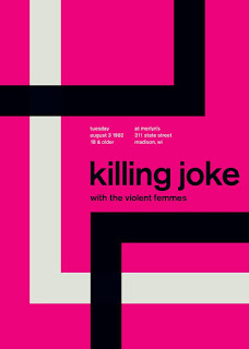
This is a retro designed poster mimicking the International Typographic Style of the mid 50's to the mid 70's. I saw this poster on a website where the artist is selling prints of his work. The quality of his work is pretty well done, a lot of his designs that claim to be of Swiss style are somewhat off. This particular poster seems to get it pretty right. It has the flush left and ragged right font setting, abstract shapes that are asymmetrical. The font is also a sans-serif that would have been predominately used during that period. I was attracted to this piece when looking through a website called Touch of Modern. It really seemed to fit with the theme.
Image
This is a World War II propaganda poster. It doesn't have a year associated with it, but I am going to say it was created in the mid 40's. It does have a publisher at the bottom and it states that is was published by the house of Seagram in New York city. It's function was to inform the public that if they were to talk to the wrong person, that information might get out and have adverse affects. I saw this poster in the museum of science and industry in Chicago. It is with their German u-boat exhibit. The quality of the artwork is pretty standard for its time. The letters are hand drawn and the shapes have been cut out. As printing was still a challenge in the 40's I believe the reproduction was done quite well. This poster follows the graphic style of the modern movement in America. I was initially drawn to this piece because my grandfather served in the navy during World War II. I was going to share this piece of American history with him.
Image
This is a label for a bottle of wine. Now that I am in this class I am starting to see certain inspirations from the graphic art periods. I saw this in a art design magazine and it screamed Swiss/International. The quality of the art work is hard to tell through this scan, but I do enjoy the flush typeface with a a real strong use of a grid. The international style has to be one of my favorite periods so this easily caught my eye.
Image
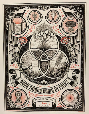
I found this image in How magazine while doing my essay. I believe it is an advertisement. It has a dot com address at the bottom. Unfortunately I am unable to make it out so I can't accurately describe its function. The image has a lot of detailed illustration in it. It is very symmetrical with banners and tapestries. This tells me that its inspiration is from the Victorian period. It has a very classical look and even though it hasn't been around to long it looks very established. While I was flipping through the pages of How magazine this image caught my eye and I knew that I had to include it in my blog.

Art Deco is found at 42nd street and Lexington Avenue.

Image
This is the Chrysler building in the lower east side of midtown Manhattan in New York City. It is an Art Deco inspired architectural structure that was finished in 1930 during the Early Modern and Art Deco movements.  I initially received a postcard from my sister when she visited New York City in the early 2000's. Reading about the movement this week reminded me of this postcard. The designs for the building were created by William Van Allen for Walter P Chrysler. The spire has a very strong Art Deco inspiration that was popular around the mid 20's to the late 30's.

Art Nouveau

Image
These images are snap shots taken from home of some drink coasters I have. They have a cork backing and have seen there better days. Once I read the Art Nouveau chapter in Meggs I remembered I owned these drink coasters. These are all from French designer Henri de Toulouse-Lautrec and have been significantly used. I have always enjoyed this style and the quality of work. Now I know in what period they were created in. This man only produced 31 posters and drew them directly on lithographic stone from memory.  My long time favorite piece is the poster on the bottom. It is a portion of the whole piece found in the text book. Toulouse's love of cats was often used in his poster designs.
Image
While is was at The Art Coop buying photography supplies I noticed this festival lineup in the front window. This is a local festival that is held here every year that has quite the unknown lineup of artists. This is a promotion poster describing all the bands that are to appear later this month. I feel the quality of work is good, the type is easy to read and the band of colors at the bottom brings your eye to the piece. The type in the header resembles Rockwell but it is not an exact match. The rest of the poster seems again to resemble Arial. This is interesting because when I was thinking about who might have designed this poster, I came to the realization that it could be the same designer that did the other post of mine. Like my previous post this image is again masculine, with a classic vibe. I feel the color adds a slight amount of warmth and that is what really drew me to the image the most.

Absinthe Blind Band Poster

Image
This is a photograph of a band poster I took in a coffee shop. Even though some of the patrons were looking at me funny, I went ahead and snapped the shot. This was a local band from here in Champaign-Urbana in the 1990's. I believe it's function was to advertise the band and the record label they were with at the time. They would call this a flat. I saw this poster at Hammerhead coffee while I was studying for Graphic Design History. The whole coffee shop was full of older band posters or what I call flats. Everything there is very music oriented. This piece caught my eye because of the design of the layout. It has a very 1990's look to it. I enjoy very simple font that is easy to read, even if the type is vertical. The font looks a lot like Arial, it is very narrow. The design is very masculine and on the colder side. Even though it has quite a classic look to it I find it to be trendy as well. Being in a band in the 1990's I really connect to this design. ...